Ghosts of Design: In Some New Montrose Construction, Echoes Of The Old Can Be Found
Pick your way down any Montrose street, and chances are the newest building there is haunted by a ghost. Contemporary, faux-Versailles, or medieval village, even the most unlikley new construction in Montrose often hides a secret: design touches meant to conjure the older neighborhood around it.
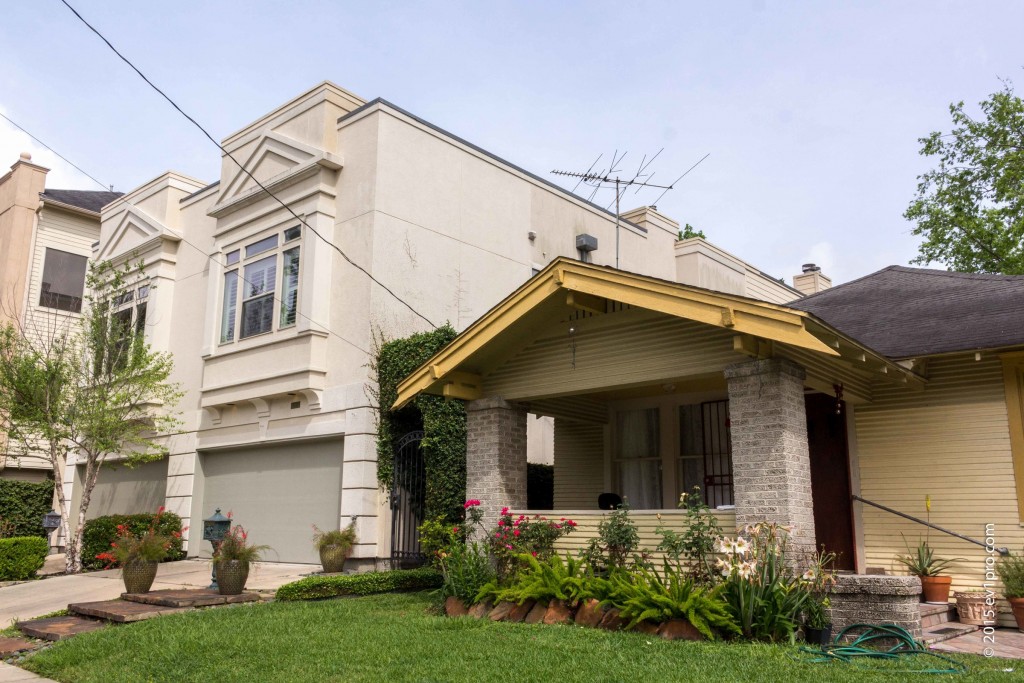
On Willard Street, for instance, a boxy stucco house looms above a wooden bungalow. Their two styles could not have less in common: while the angular new building is all sleekness and clean planes, the bungalow is decked with carpentry flourishes. Even the rooflines clash. On the newer house a stair-like façade hides a pitched roof that, on the older house next door, is the most distinctive feature.
Yet smack in the middle of the monument to the modern is a line of windows that look as if they’re from another house – the bungalow next door, to be exact. Double-hung windows – one window pane positioned above the other – are a classic feature of 1900s bungalows. And on inspection, the double-hung windows on the stucco house precisely mirror those on the bungalow next door.
That’s not chance, says Stephen Fox, a lecturer at the Rice School of Architecture and author of the Houston Architectural Guide. In fact, Fox says, there are explicit echoes of older construction on new buildings throughout the city. ”It’s from a 1970s movement called contextualism,” he says. ”It grew out of a reaction to modernism, where buildings were just expressions of the materials of their construction, the site, and the climate. Contextualism responded to the built environment.”
Fox has agreed to show some of the places in Montrose where architects have added vintage touches to new buildings that are seemingly from a different dimension than the neighborhood around them. Dressed in a summer suit and a persimmon bow tie, Fox consults an envelope scribbled with addresses. Within five minutes of leaving the Rice University campus, he stops the car.
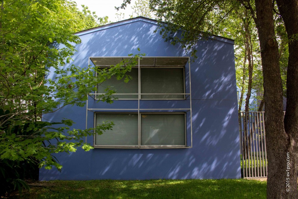
”This complex was designed by architect Carlos Jimenez,” Fox says. ”He’s very sensitive to the surroundings.” A studio building, periwinkle blue and set in a small sea of fig ivy, is lovely. But it is also cube-shaped, with no wooden details at all, and while it harmonizes with the small houses around it, it’s hard to say why.
Beside the studio stands a block-like brick house, also designed by Jimenez. Spare as it is, the building looks similarly at home in its environment. To explain why, Fox points to rectangular windows and a metal grid garage gate that echoes the wire fence of the bungalow to the right. “The gray painted steel of the garage matches the color,” he says. “And you can see the same grid design in the transom, the windows, on the bungalow door.”
Though the house is bigger than its neighbor, it doesn’t seem overwhelming, Fox adds, because it’s set back from the street rather than devouring every inch of its lot.
Heading west, Fox explains more about the ghosts from the past that haunt so much new construction here. Before modernism and post-modernism, there was 19th century eclecticism. “It was all about style, classicism or other styles, with no regard to what was around it,” he says, ”Modern architecture, beginning in the 1930s, rejected style. Instead, it responded to the materials used in a building, and to natural phenomena. Post-modernism then reacted against modernism with contextualism, which was an effort to recognize the previous architectural legacy of an environment. It was a conversation with existing buildings.”
This hardly meant that the post-modernists were interested in copying bungalows or Victorians. Instead, architects who came of age in the 1960s and 1970s paid attention to the buildings in a neighborhood and chose one or two motifs to quietly tuck into an otherwise new design.
Today, post-modernism is as out of fashion as modernism was before it. But the impulse to revive details from the architectural past lives on.
”What intrigues me,” Fox says, “ is that even people who demonize post-modernism still often default to contextualism in their designs. It’s residual training.”
Not that every structure reflects that training.
To Fox’s eye, houses designed by architects tend to look different from those built by developers. “It strikes me that the buildings of architects in Houston try to fit into an environment rather than stand out,’’ he says. “Developers have a different point of view. They want to attract buyers, so they want their buildings to stand out. They add as many details as they can to get attention.”
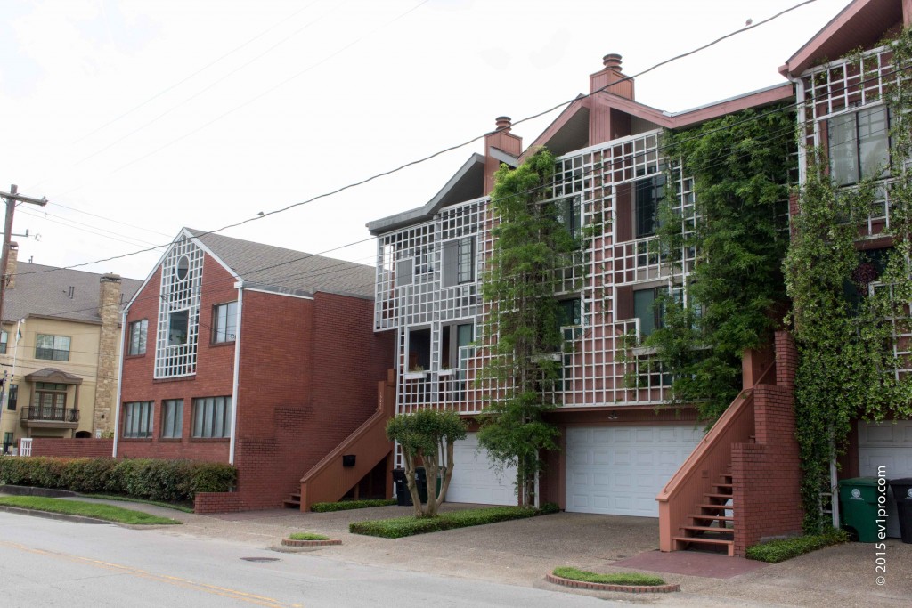
Fox has more to say about architect Shafik Rifaat’s complex on Fairview Street. Rifaat’s office, a fairly conventional looking brick building with a peaked roof, stands on the corner. Beside it stand three buildings Rifaat designed in the 1980s, adjoining townhouses punctuated by red outside staircases and completely covered in front by jasmine-laced lattices.
“The office was an existing structure,” Fox says. “Rifaat probably altered it, adding the gable, as a symbol of deference to context.” Meanwhile, the flowery townhouses, although dissimilar to the traditional architecture in the neighborhood, reflect common Montrose building materials and the neighborhood’s characteristic greenery. Poised at the top of the townhouses’ structures are Rifaat’s interpretation of gables – split in the middle by chimneys, but still classically peaked.
“If you’re a good post-modernist, “ Fox says, “you make these kinds of gestures.”
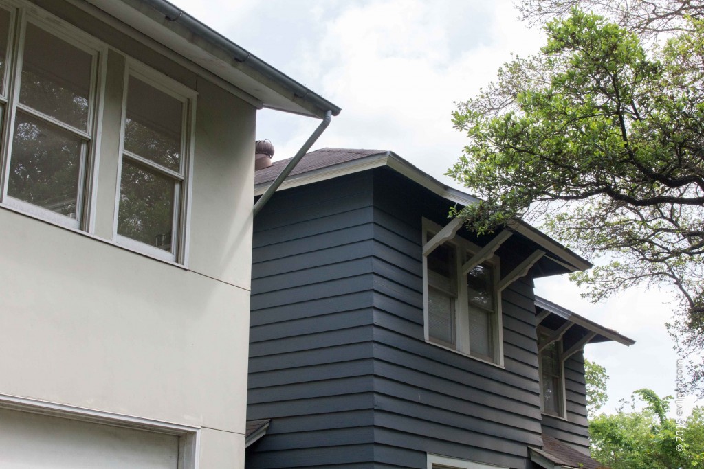
Fitting in with the neighborhood, though, needn’t involve traditional motifs or materials. Fox is most partial to projects such as our next stop, a complex at 1418 Kipling designed in the 1990s by architect Val Glitsch for the late Liz Lunning, a paper curator at the Menil Collection. The plain, gray structure in front is definitely modern. In contrast to the bungalow to its right and the two-story clapboard to its left, the building covers an entire lot and its façade is a single plane.
Look more carefully, Fox instructs. The whole complex is a study in humility toward its surroundings. The building in front was Lunning’s studio; the main house was built in back, out of sight of the street so as not to overwhelm the smaller neighboring houses.
Though at first the building’s façade looks blank, horizontal lines have actually been scored carefully into the stucco. They lines are a friendly gesture, conversing with the houses on either side by continuing the roofline of the bungalow and echoing the clapboards of the blue house on the right. A curvy-limbed sapling, planted in the last few years, echoes the live oaks that spread over the street. The roof is peaked. And, just below the eaves, a series of double-hung windows pays tribute to Montrose’s signature housing style.
“The fact that they built over the whole width of the lot could have been overwhelming. But they ameliorated it with the windows and roof,” Fox says approvingly. “There’s no big fence, because the front building serves as a fence. And they decided not to make the biggest building they could.”
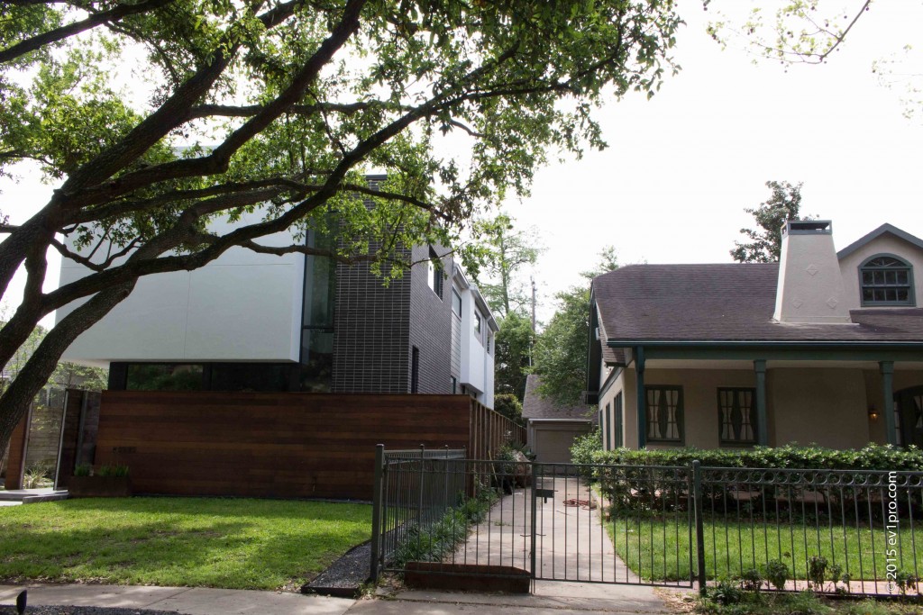
In fact, Fox argues, the most respectful new houses in Montrose barely use motifs at all. We stop outside one of his favorites, architect Allen Bianchi’s 2007 design at 1625 Harold Street. Flanked though it is by bungalows, there is nothing vintage about this structure at all – not so much as a pitched roof. The building is unapologetically rectangular and spare, the top half dominated by a featureless white stucco plane.
“Architecturally, this is completely unlike the houses next door,” Fox says. “And there are no motifs from them. Instead, it’s an attempt to be contextual using space and geometric shapes.”
If you look at the bottom segment of the house, he points out, the expanse of warm wood paneling makes the house seem approachable while echoing the traditional materials of older neighbors. The stretch of stucco is sociable as well, he says, creating a visual bridge from the bungalow on the left all the way to the one on the right.
Tucked between the paneling and the white stucco, a narrow bank of windows is carefully set back several feet from the façade. This, too, is on purpose, Fox says. “It’s a way of compensating for the fact that the scale of the new house is much bigger than the adjoining 1920s houses,” he says. “And because the windows are set back, the front of the house doesn’t seem flat.”
For Fox, buildings that converse with Montrose’s century-old houses without aping them is the next best thing to saving those houses. “Most of the new construction here,” Fox pronounces, “I look on with contempt or disinterest.” In a better world, he says, the city would provide leadership to make Montrose a conservation district, if not a historic district. In the meantime, he says, “To me, good architecture goes with anything in the environment where it is built.”
Whether it’s a pitched roof, old-time windows, or a grid that exactly echoes an antique transom, details matter less to Fox than smart design.
But for longtime Montrose residents, people who have paced and played and daydreamed on these streets for decades, hidden touches in new buildings can bring some comfort. Houston means constant change: most who live in this city expect it. It’s just that the buildings of Montrose for so long seemed exempt. They were anchors, set down in the past, even as generations of new occupants swept in and out.
Those anchors are now slipping. True, neighbors still walk the pavement in the mornings and at twilight, passing whole stretches of buildings unchanged since the 1920s. In 50 years, though, such stretches will be far harder to find. Hidden in new buildings, the small salutes from today’s architects may be the shadows that remain.
